Pinterest will show you a thousand rooms tagged “cottage decor,” and half of them are actually farmhouse, coastal, or just… beige with a wicker basket. That’s the problem with a style this popular the label gets slapped on anything vaguely cozy. Real cottage decor follows a fairly specific set of rules: layered pattern, warm imperfect materials, furniture that looks collected rather than purchased as a set. This breaks down what actually separates the look from its cousins, what to prioritize if you’re starting from scratch, and where people usually go wrong trying to get there on a budget.
What Actually Makes a Room “Cottage” Style
Cottage decor grew out of small, older homes genuinely modest cottages, historically where rooms were furnished over decades rather than in one trip to a store. That history matters because it explains the defining trait: nothing matches perfectly, and that’s the point, not an oversight.
Think mismatched dining chairs painted different soft colors, a quilt that’s clearly been used for years, floral wallpaper that would look busy anywhere else but works here because everything around it is calm and textural. The style leans into imperfection a slightly worn rug, a chipped ceramic pitcher used as a vase rather than the flawless, styled-for-a-photo look a lot of modern decor chases.
What’s the difference between cottage and farmhouse decor?
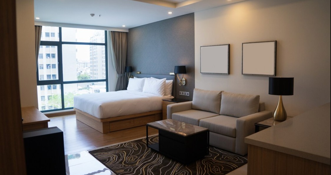
Farmhouse decor is more rustic and utilitarian think shiplap, black metal accents, and a fairly restrained neutral palette with maybe one accent color. Cottage decor is softer and more colorful, built around florals, pastels, and a genuinely lived-in feel rather than farmhouse’s more curated “simple life” aesthetic. If your room has more white oak and black hardware than pattern and color, you’re closer to farmhouse than cottage, even if both get tagged the same way online.

The Color Palette That Defines Cottage Decor
Color does more work here than in almost any other design style, and it’s where a lot of attempted cottage rooms actually fail either too neutral (reads as farmhouse) or too saturated (reads as maximalist boho instead).
What colors work best in a cottage-style room?
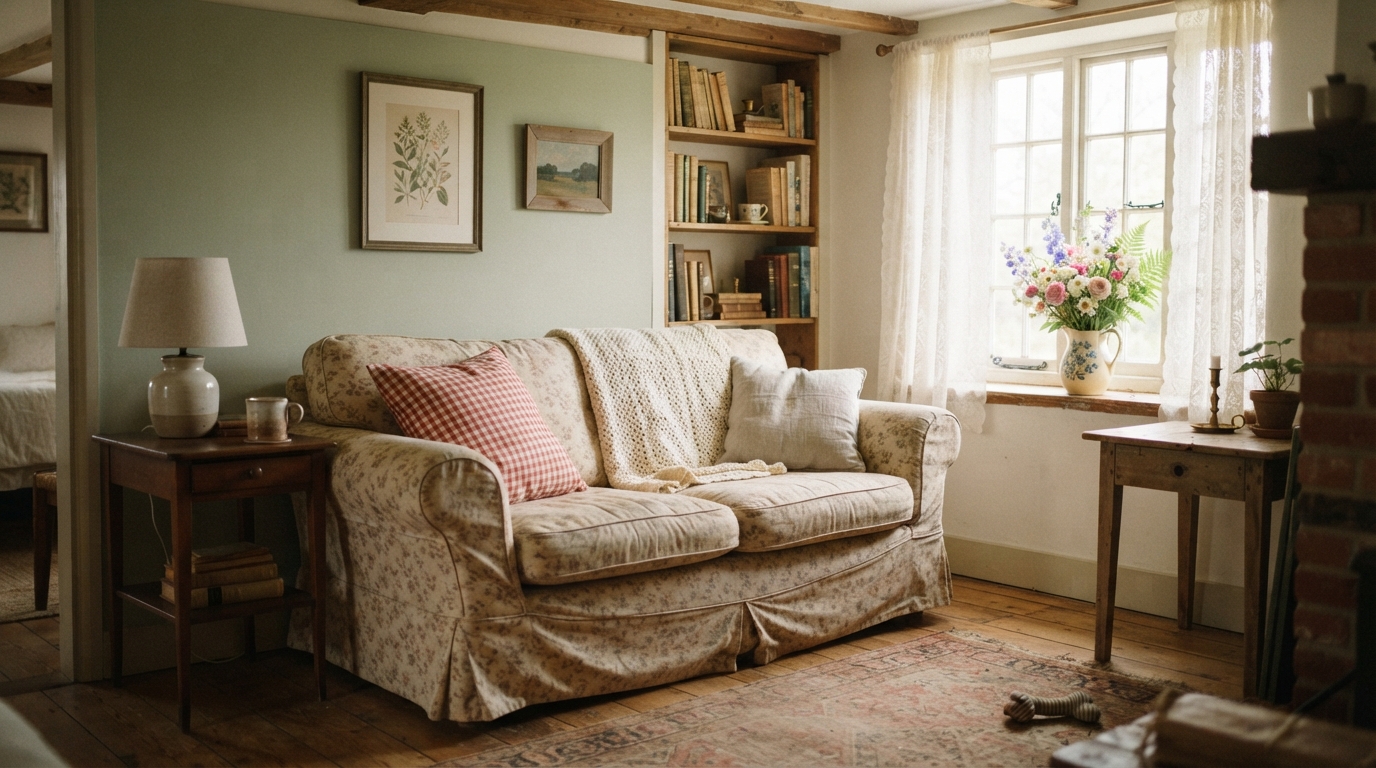
Soft, slightly faded pastels dusty rose, sage green, buttery yellow, powder blue form the base, layered against warm whites or creams rather than stark bright white. These colors should feel a little muted, almost sun-bleached, rather than crisp and saturated; that faded quality is what reads as “collected over time” instead of “just painted.” A single deeper accent color, often a warm red or forest green, keeps the palette from tipping into precious or twee.
I’d avoid cool grays entirely here they read modern and clinical, which fights against everything cottage decor is trying to do. If a paint chip looks like it belongs in a 2015 farmhouse kitchen, it’s probably not right for a cottage room.
Furniture and Materials Worth Prioritizing
Furniture is where the “collected, not matched” philosophy really shows up, and it’s genuinely the easiest place to get the whole look wrong by buying a coordinated set.
Should cottage furniture match or mix?
Mix, deliberately a set of dining chairs that all coordinate but don’t match exactly is far more authentic to the style than a uniform matching set from one store. Vintage and secondhand pieces do a lot of heavy lifting here; a scuffed wooden side table from a thrift store often looks more “cottage” than anything brand new, since the wear itself is part of the aesthetic. Rattan, wicker, and painted wood show up constantly for a reason they’re warm, textural, and age visibly in a way that suits the style rather than working against it.
Upholstered pieces lean toward slipcovers, florals, or gingham rather than sleek leather or heavy velvet, which read as too formal for the relaxed, worn-in feel cottage decor is going for.
Textiles and Pattern Mixing
This is genuinely the part people either love or find overwhelming, and it’s worth practicing before committing to a whole room.
Layer at least two or three patterns in a space a floral on the curtains, a gingham or stripe on a throw pillow, a small-scale ditsy print somewhere else as long as the colors stay within the same soft palette. Solid-colored anchors (a plain sofa, a neutral rug) keep the pattern mixing from tipping into chaos. Quilts, crochet throws, and lace details all belong here too, ideally things that look like they could have been handmade or passed down, even if they weren’t.

Small Details That Make or Break the Look
The difference between a convincing cottage room and a generic “cozy” one usually comes down to details most people skip entirely.
What’s a common cottage decor mistake?
Buying everything new is probably the single biggest one a room furnished entirely from one store’s current catalog reads as staged rather than lived-in, no matter how “cottage” the individual pieces claim to be. Fresh flowers or dried botanicals in a mismatched vase, an open bookshelf with actual worn paperbacks rather than decorative objects, a window box or potted herbs on a sill these small, slightly imperfect touches do more for authenticity than any single big furniture purchase.
Conclusion
Cottage decor works because it embraces imperfection instead of hiding it mismatched furniture, faded pastels, textiles that look handled rather than staged. Skip the matching furniture sets, lean into secondhand pieces and layered pattern, and keep the palette soft rather than stark. Get those fundamentals right and the room reads as genuinely collected over years, which is the entire point of the style not something you can fake with one coordinated shopping trip, no matter how good the individual pieces are.
FAQs
What’s the easiest way to start decorating in a cottage style?
Start with paint a soft, slightly muted pastel on the walls and build outward from secondhand or vintage furniture pieces rather than buying a full matching set new.
Is cottage decor the same as shabby chic?
They overlap significantly, though shabby chic leans more heavily into distressed white-painted furniture, while cottage decor allows for more color and pattern variety across the whole room.
Can cottage decor work in a modern apartment?
Yes the style translates well to smaller spaces since it relies more on texture, color, and layered textiles than on a specific architectural setting like exposed beams or a fireplace.
What colors should I avoid in a cottage-style room?
Stark cool grays and bright, saturated primary colors both tend to fight against the soft, faded palette that defines the style, so it’s worth steering clear of either extreme.